Article | by Amy Fleming
4 big lessons from World Information Architecture Day
Article | by Amy Fleming
The theme of WIAD 2018 was Information Architecture for Good, which brought up interesting questions and topics for discussion. Here are four lessons Amy learnt from WIAD Manchester 2018.
Dan Ramsden, Creative Director for UX Architecture & Design Research at the BBC, began the day asking ‘What’s the point in IA?’ and demystified the idea that IA is just about sitemaps. He used the metaphor of a deck of playing cards to explain his reasoning. A blank set of playing cards holds no information - the cards cannot be distinguished. However, with a deck of playing cards that have their colour, suits and number, we have a set of properties we can manipulate the deck and spot anomalies (the joker!). Without these properties, we cannot make use of the deck. He believes “good information architecture allows teams and audiences to get a higher degree of situational awareness”, adding “information shapes behaviours”.
Thinking of IA in this way gives it more importance in the design and development of digital products. In his time at the BBC, Dan has worked on how the BBC visualise their information, specifically news articles, in different contexts.
Adding imagery, videos, headings and sub-headings makes information easily digestible to users, no matter the context.
"Good information architecture allows teams and audiences to get a higher degree of situational awareness"
Dan Ramsden, BBC Creative Director for UX Architecture & Design Research
Paul Rissen, Product Manager for BMC and SpringerOpen, spoke about how the ‘honeymoon’ period of the internet is over, as we move into a ‘post-truth’ society where we can’t trust anything we read online. With the rise in ‘fake news’ and organisations forwarding their agenda to the masses without reliable sources, Paul has created 13 rules for designing better information environments. One that stood out was ‘attention does not equal value’, alluding to the way social media platforms are now presenting information to users. Twitter, for example, now shows non-chronological tweet timelines, ordering tweets by number of like and interactions.
Taking away the chronological ordering of Twitter has led to confusion and distrust from users, especially in tragedy. We, as users, need to remember that just because a statement, quote, or even a tweet is gaining lots of attention, it does not equal value.
"Never is the non-chronological timeline more incoherent than after mass tragedy. News surfacing 15 hours late, totally out of date/context."
Lindsey Wiebe (@lindseywiebe)
The Home Office has a big job on their hands; building and running digital government services for all users. They have been working hard to update the GOV.uk website by taking all the content and transactions on GOV.UK and putting them into a coherent service journey that a user understands. Katy Arnold, Head of User Research and Design at the Home Office spoke about how user research was vital to understanding and designing inclusively.
Alongside the website project, the UK Government created a set of design principles for teams in government to use when creating user-centred digital services. Katy ran through the design principles, with the first one being ‘Start with the users needs’. These needs can be difficult to find when paired with research conducted in 2013, which found 31% of the UK population have low digital skills. So, the user researchers from the Home Office spent three months researching the needs of low digital skill users, which helped identify issues in the current website design and how it could be improved. Testing products with people of varying levels of digital skill helped to find problems more quickly and create an inclusive service for everyone.
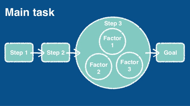
As the IA of a website becomes more complex, it becomes increasingly difficult to make sense of the information we are being presented. Trying to navigate a website without a clearly defined structure leads to incomplete and confusing user journeys. Jesmond Allen, co-author of Smashing UX Design, believes the solution to designing a complex website is task modelling. Task modelling involves identifying concise diagrams of steps users will go through to complete a specific goal. Task models are easy to create and can even give a clear structure for a website. Here are the three steps to creating a task model:

Image source: Jesmond Allen
Reiterated again by Jesmond, before you can draw out a task map you need to know what your users’ goals are. Conducing user research to understand how they would complete a goal lays the groundwork for an initial task model.

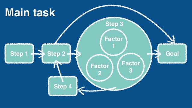
Image source: Jesmond Allen
From the findings of the user research, you can begin to create an order of sub-tasks needed to complete a goal. Here you will find outliers and factors which will influence the next steps for the task.

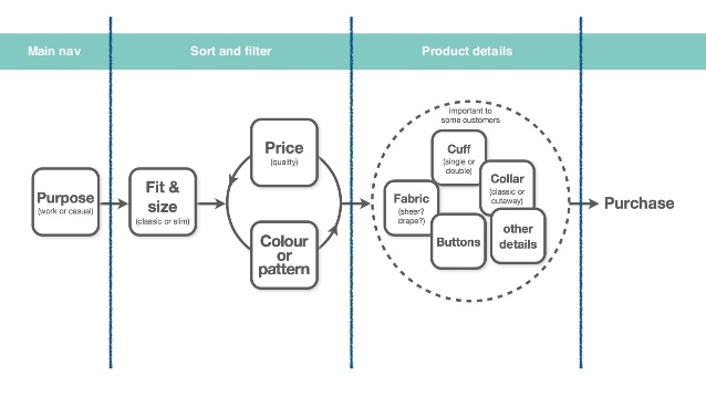
Image source: Jesmond Allen
Finally, draw out your task model using boxes to represent a task, arrows for flow, and circles for factors (with smaller circles for sub-factors). Looks like a washing machine, right?
A complete task model gives a concise overview of a route to goal.
"Task models tell you how to structure your site, what information to provide where, and what design patterns to use where to support the stage of the journey the user is at."
Sophie Dennis (@sophiedennis)
WIAD 2018 had a large focus on users and how to best represent the amount of information housed on the internet. As it becomes increasingly difficult to know who to trust online, the speakers of WIAD Manchester inspired IA and UX professionals to protect society from misinformation . To this end, techniques such as task modelling, design models and user research. Dan Ramsden summed it up perfectly:
"IA is an invisible stable truth in the middle of an equation with requirements on one side and capabilities on the other.Information Architecture is the equals symbol."
Dan Ramsden