Article
The mammoth task of multi-source data integration
We've challenged our web developers to talk us through a recent data integration task we faced on one of our projects: the Arriva Bus website.
Article
![]()
German software provider HaCon had recently started work with Arriva – pulling route data into a new journey planner app (one of HaCon’s off-the-shelf products). Exciting as it was for Arriva and hundreds of thousands of bus users around the UK, this actually meant some pretty hard work for us. The team worked tirelessly for months, finally getting a solution in place which took the data from HaCon, overlaid it with the many Arriva routes and presented simple timetables via the website.
To make things difficult, Arriva were managing their ticket zones (areas of the UK where travelers can use unlimited tickets) separately to their route data, which had made finding relevant tickets for particular routes pretty much impossible for end users.
We had recently become aware that Arriva were starting to plot these ticket zones using polygons. As a developer at Freestyle, I was tasked initially with a proof-of-concept to show how we could use Google maps as the middle-man to make these routes and zones function together.
The task was to extend the current map they had, which contained the markers of a journey, plus polylines, and split the surrounding area into ‘zones’. Then we needed to determine if a marker on the map landed in one or more zones. This would enable users to find a route, and subsequently be shown the necessary ticket fare information within the same experience.
At this point, we already had a Google map with the marker points and polylines on, so half of the work was already done. The marker points and routes came in the form of a JSON object from a web service, so it was a case of simply extending the functionality of this to incorporate the zonal data.
We were given some sample data in the form of ArcGIS data files, so the first task was to work out how to transform this data into something we could use that would integrate with what we had. As we were using Google maps for the actual mapping element, a little research suggested KML files. This was great news for myself, having worked with KML files in the past for other projects.
I discovered a website where you could upload the ArcGIS files (sorry, it looks like this link has expired!), and it would hand you back either a KML file (a single file containing your polygon data) with no other data; or a KMZ file – a zip file containing the kml file, plus supporting information such as markers etc. I didn’t require all of this information, as we already had that – KML file it was.
Adding in a new KML layer to an existing map is really easy. Refresh your page, and the KML layer appears.
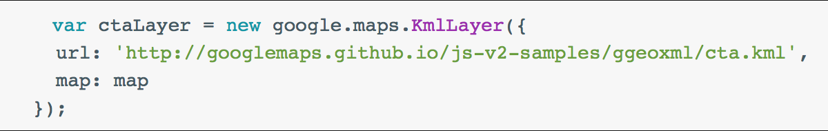
There is one ‘gotcha’ though: the KML files have to be on an internet-facing location, where Google can see it to load the data. Quickly upload the files to a temporary location, and off we go.
Next was to research how to interact with this new layer to see if each point was in a layer. This proved a little tricky, until I came across an article on StackOverflow which mentioned that in order to interact with this new data, I had to actually plot the points myself, rather than just use the KML layer (which would have been much easier).
Because I couldn’t interact with a KML layer, the next task was to do it manually. KML (or Keyhole Markup Language) files are based on XML files, so dealing with these should have been fairly straight-forward. Opening the KML file, I saw that it contained one or more ‘folder’ elements. Within this, were a few more elements detailing the style of the polygon, plus a name etc. The one I needed was ‘polygon’. This contained a child-element of ‘coordinates’ – one big list of co-ordinates that detailed the polygon.
The first task here was to get that data into a format I could use. I split the string up first by spaces, so I ended up with a collection of strings like this:
-1.8117973000000003,52.63122890000001
I then split each string into its constituent parts of longitude and latitude. A quick edit of the web service later, and I had a function that would load my KML file, read out the co-ordinates, and return me a collection of GeoCoordinates, which I could use. A quick amend of the javascript later, and I had the polylines drawn:

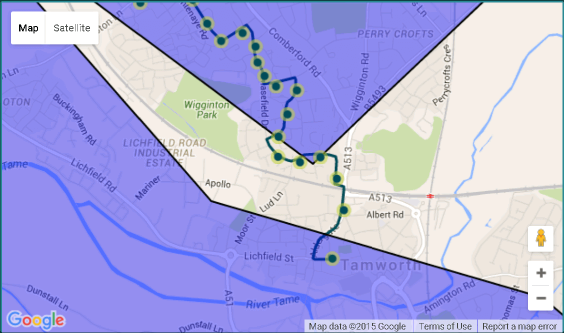
No visible difference, but crucially, I could now interact with the zones (in purple).
Once I had my zones plotted on the map, it was time to check where the markers sat in relation to the zone. I had a collection of route points (my map markers), and a collection of polygons (my zone data).
Iterating through each polygon, I checked each map marker in turn to see if the latitude and longitude co-ordinates of that point were inside the polygon:
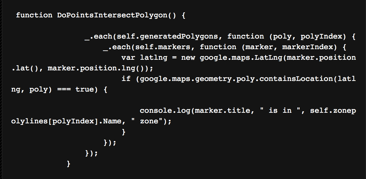
If it matched, I rendered out to the browsers console (Firebug for the win), detailing which map point was in which zone. The proof of concept was complete, and successfully proved what I set out to do.
There’s sure to be further refinement and refactoring of code, but it certainly felt like a job well done, which should mean lots of happy passengers.
Check out our Arriva Bus case study to read more about the wider project.

Technical Director
Guy's been at Freestyle for over 12 years. When it comes to technology - he's the person we turn to. Whether it's a web build, integration or Freestyle Partners Digital Asset Management, speak to Guy about your next project.