Article | by Amy Fleming
Spotlight Q&A with... Brammer's Channel Director
In this Q&A we explore the narrative around customer-centric content and the human element of B2B marketing.
Article | by Amy Fleming
![]()

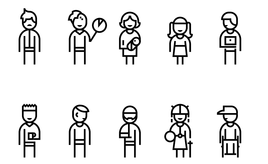
Credit: Microsoft Inclusive Design Manual
When we hear the word ‘accessibility’ in the digital sector, we often think about screen readers, ALT tags in code or the accessibility guidelines we are expected to adhere to. However, it’s much more than that. Rather, it is about creating inclusivity - allowing everyone, no matter their circumstances, to experience the world in the same way as everyone else. Elizabeth is championing inclusive design and wants to challenge the stigma and myths surrounding what is a disability and how we can create inclusive products.

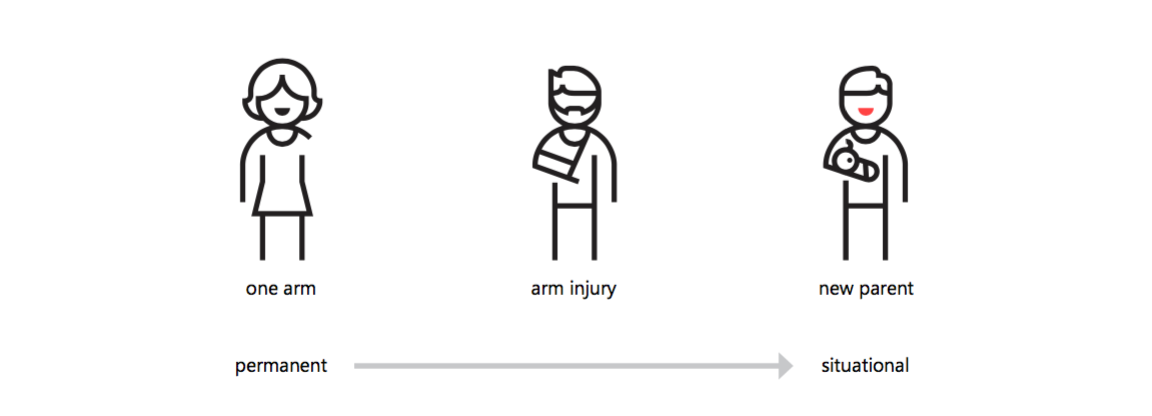
Credit: Microsoft Inclusive Design Manual
Elizabeth gave a great example of how impairments can affect us all.
Take this scenario: you have landed in Shanghai to attend a business meeting. You need to find directions to your hotel so have downloaded a mobile travel app. Here are four different types of impairments you could have whilst using the app:
I don’t know about you, but I had never considered temporary impairments as a disability. In a previous article, I wrote about the importance of developing products with permanent disabilities in mind, but once you delve deeper you realise the vast amount of hinderances people have on a day-to-day basis which can affect how we use a product.
As someone who cares about how people use a product, it is a no-brainer to me that accessibility needs to be considered at all stages of product development. But, this shouldn’t be a one-man (or woman) mission. Getting team buy-in from account managers to designers to developers is vital to creating a product which considers the user at every stage. Here are four amazing statistics Elizabeth gave in the case for accessibility:
With outstanding numbers like these, how could any business not want to ensure their products are inclusive?
So, you’ve got buy-in from the business; how do you incorporate inclusive design on a day-to-day basis? As Elizabeth said, you need to integrate processes as early as possible, starting from UX, design, development to QA. Building accessibility into a product needs to be in the businesses mindset, and the responsibility of the experience comes from the whole team, not just UX. It can take time to weave accessibility into your company’s processes, but luckily, there are a number of desk applications we can use throughout to keep accessibility on the forefront. Here is a list of just some of them:
From attending UX Oxford and listening to Elizabeth speak passionately about inclusive design, I believe it is more imperative than ever that we bring accessibility to the forefront of the development process. As Elizabeth said, inclusive design is empowering, gives independence to those with impairments and allows equal opportunities for everyone. This article has just scratched the surface of digital accessibility, and I’m looking forward to deepening my knowledge in this area and to be a champion for inclusive design.